Personio
Boosting recruiter efficiency by making candidate screening faster
Role
I led the design of recruiting features for Personio. Partnered with 2 product teams where I collaborated with 10+ engineers and 2 product managers.
Overview
Personio, one of Germany's most valuable unicorns, offers HR software tailored to small and medium-sized enterprises (SMEs).
Personio’s Recruiting module provided an extensive range of features, operating almost like a standalone product, and played a crucial role in driving a significant portion of the company’s revenue. By the time this initiative began, Personio Recruiting has already achieved a product-market fit, with over 6,000 satisfied customers, due to the extensive feature set it offered.
After establishing its position in the market, Personio needed to improve the user experience while continuing to add new functionalities to their feature set. This redesign effort sought to benefit the hiring team, especially recruiters and hiring managers, who spend the majority of their workday screening candidates.
TARGET USERS
Recruiters and hiring managers in small and medium-sized enterprises
THEIR TASK
Screening and managing candidates for 5-8 hours a day
The application profile before we started the redesign
Problem
Tedious and error-prone screening caused a lot of wasted time
Fast screening in recruiting is crucial to avoid wasting recruiters time and stealing time away from focusing on top candidates. Slower screening meant top candidates would be hired by another company because that company moved more quickly with an offer.
“ Big chunk of my work is screening and I need to do it effectively to spot the most promising candidates and keep my focus on them - and I need to do it all day long. ”
— Recruiter, at a small sized company
The interface was unintuitive and unwelcoming for especially new users
Considering Personio’s ambitious plans to expand in the market and gain new customers, the interface had to become a lot more self-explanatory. While existing users adapted to this setup over time, it still had room for improvement.
Overall, the experience of the software was very archaic and had a lot of room for improvement.
After the redesign
Let’s make sure the hiring team can focus on what’s most important for their job - finding the right talent!
Design decision #1
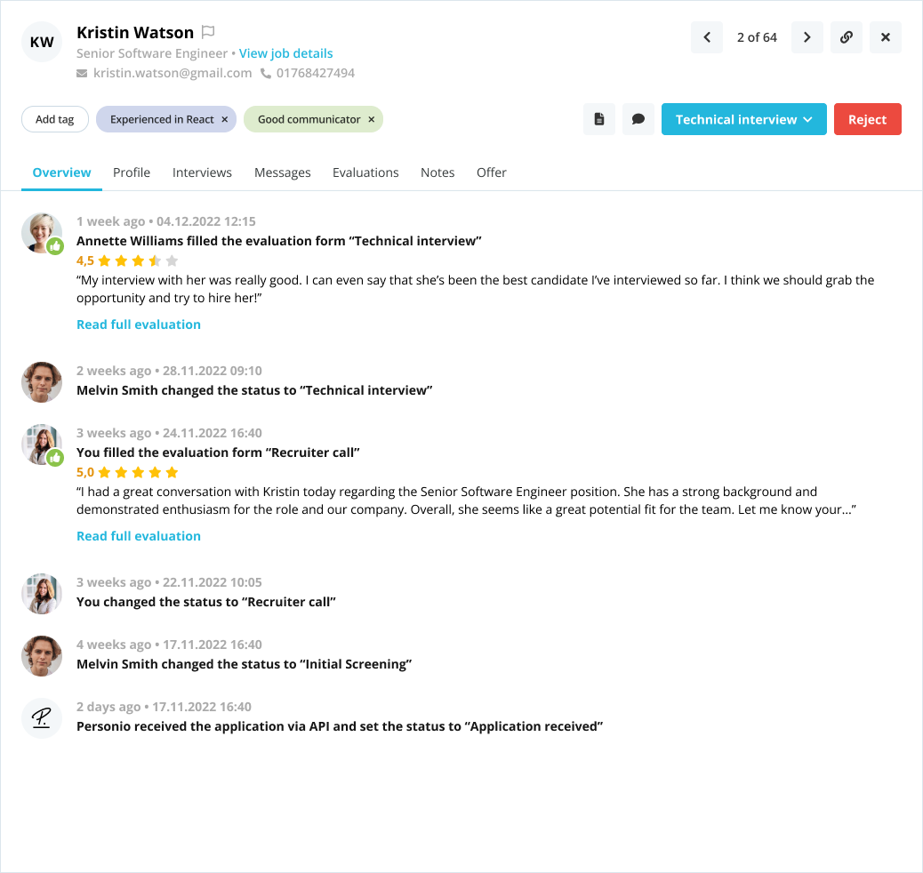
Recruiters can now instantly grasp the candidate type and application status at a glance
They can easily see which stage the candidate is in and get a clear overview through the recruitment activity timeline, ensuring smooth team collaboration.
Design decision #2
Simple, intuitive interactions allow recruiters to quickly document their reflections on a candidate
The revamped tag experience ensures recruiters can easily capture key candidate information for themselves and the hiring team.
We introduced the ‘Priority Applications’ feature, allowing recruiters to mark top candidates and track them closely throughout the process.

Design decision #3
Redesigned filters make it easier to access specific application groups while preserving usual filter sets for a smoother workflow

Design decision #4
What’s expected of them to do is now easy to find
Before recruiters and hiring managers struggled to understand what was asked of them to do. Now, review requests are clearly separated from the recruiting activity timeline.

What was keeping Personio Recruiting archaic?
(1/4)
Accessing a group of applications for screening was not intuitive for recruiters
The application list, being the highest-traffic page in the product, lacked clear design cues to help recruiters identify the positions they were viewing. The mix of different filtering components created confusion around how to provide input and which results they were seeing.
(2/4)
Recruiters found it hard to process candidate information when screening
The application list, being the highest-traffic page in the product, lacked clear design cues to help recruiters identify the positions they were viewing. The mix of different filtering components created confusion around how to provide input and which results they were seeing.
(3/4)
Recruiters dealt with excessive complexity for achieving simple tasks
Recruiters needed an easier way to highlight key candidate information, organize applications, and streamline workflows. The suggested solution was using "flags," but adding and managing them was overly complex and felt more like a technical task.
(4/4)
Lastly, the lack of a clear visual hierarchy slowed recruiters' ability to quickly scan evaluations and determine the next steps
Hiring is a team effort, and recruiters need to quickly review their team members' evaluations to decide on the next steps. However, recruiters struggled to understand others' evaluations and what actions were required of them at a glance.
Impact
⚡ Faster Recruitment — Helped streamline workflows, enabling faster hiring decisions and reducing bottlenecks in the recruiter journey.
📈 Boosted Productivity — Contributed to meaningful time savings across key HR tasks, freeing up teams to focus on what matters most.
⏱️ Minutes Saved on Every Screening Task — Optimized repetitive interactions, cutting down valuable minutes from daily operations at scale.
💬 Positive User Feedback — Received strong NPS comments and played a part in the upward trend of UXSAT scores for the recruitment experience.
🧩 Internal Impact — Led the redesign of the Filter, Dropdown, and Tag components across the platform and partnered with the Design Systems team to roll it out through Personio’s DS for broader impact.
Reflections
🔄 Product Redesigns: Incremental vs. Overhaul
I had the chance to implement numerous incremental changes, and while a full UX overhaul might feel more glamorous as a designer, this experience taught me that regular, small updates solved most user issues. We received positive feedback from users, and the targeted improvements aligned perfectly with our agile way of working — 2-week sprints within a product team.
📊 Measuring Numerical Product Impact: Absence of Analytics Tools
As a hyper-growth start-up, we didn’t yet have the ideal tools to track precise data, which made it hard to measure numerical product impact. However, we compensated with customer interviews, insights from our Customer Advisory Board, and user feedback from various sources like NPS. Based on what we can actually track, we improved the user experience and the recruiters' efficiency tremendously.
🛠️ Technical Challenge: Monolith
The biggest technical challenge we faced was that our recruiting product was coded in Monolith. To address this, we moved each tab under the Applicant Profile to its own Micro front-end, one by one. With each transition, we were able to introduce design updates, all while navigating the technical complexity.
🎨 Working with an Existing Design System
At the time, our Design System was still developing, with many components not meeting the highest standards. While I was able to contribute and improve components like Filter, Dropdown, and Tag, I had to work with many existing ones. This resulted in not being completely satisfied with all components being used in my design but still, I am happy about the progress I was able to make.